
Styling Spring Colours
Spring invites a softer way of dressing. Colours feel lighter, fabrics more fluid, and details become more considered. From warm yellows to cool blues and fresh greens, each shade carries its own mood.
Jewellery becomes the element that brings everything together. Through pearls, gemstones and hand-formed textures, each piece reflects light, colour and movement in its own way, allowing your styling to feel both natural and intentional.
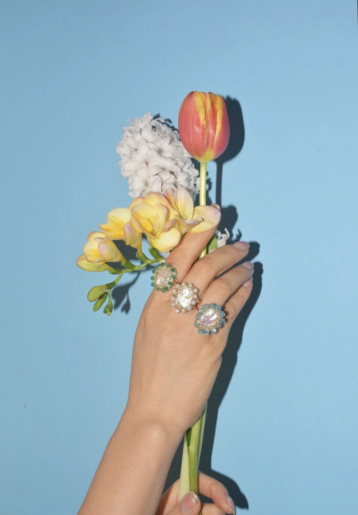
Pastel Yellow
Pastel yellow carries warmth and quiet optimism. Soft yet radiant, it pairs beautifully with pieces that echo light through gentle iridescence and floral form.
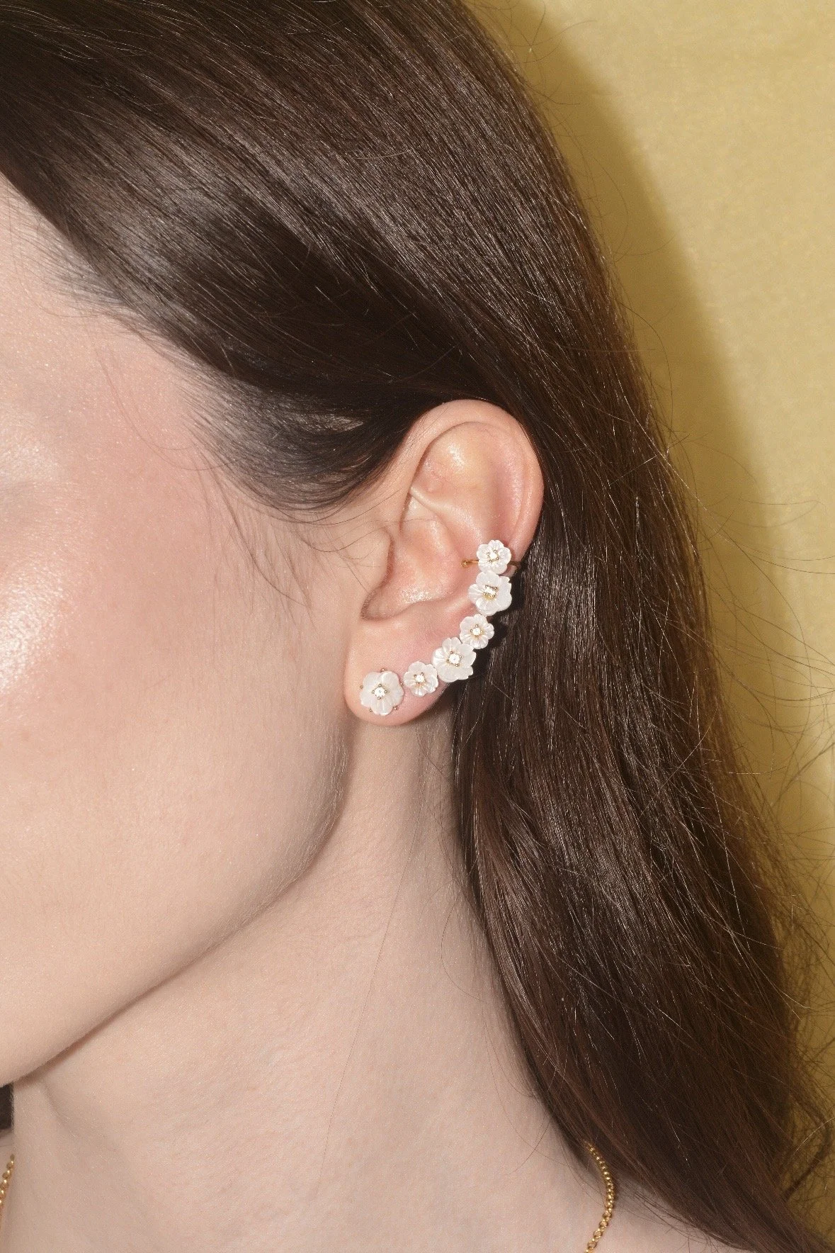
Bloom – White Mother of Pearl
Bloom in white mother of pearl reflects the softness of petals in bloom. Each sculpted form captures light with a gentle, luminous glow, creating a delicate balance against pastel yellow tones.
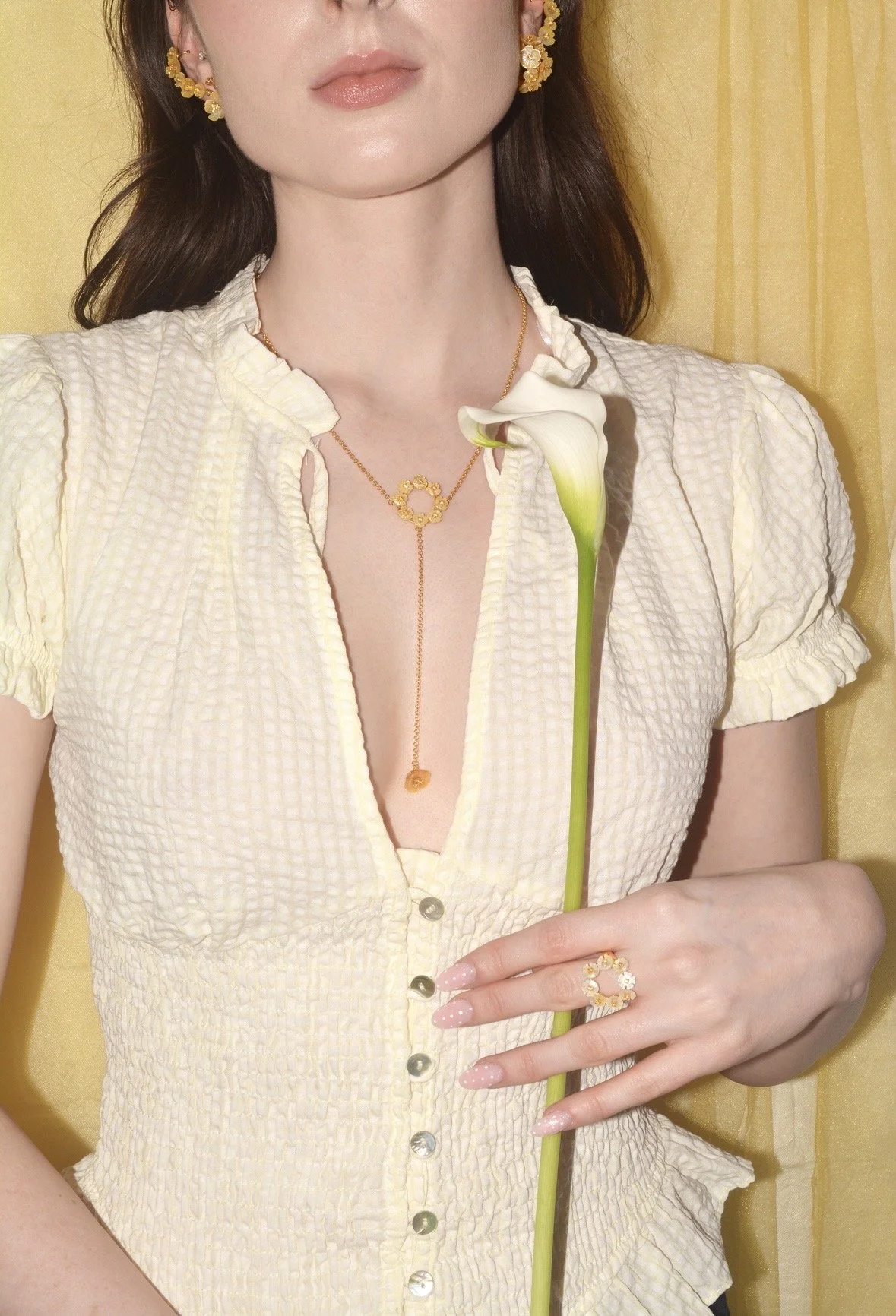
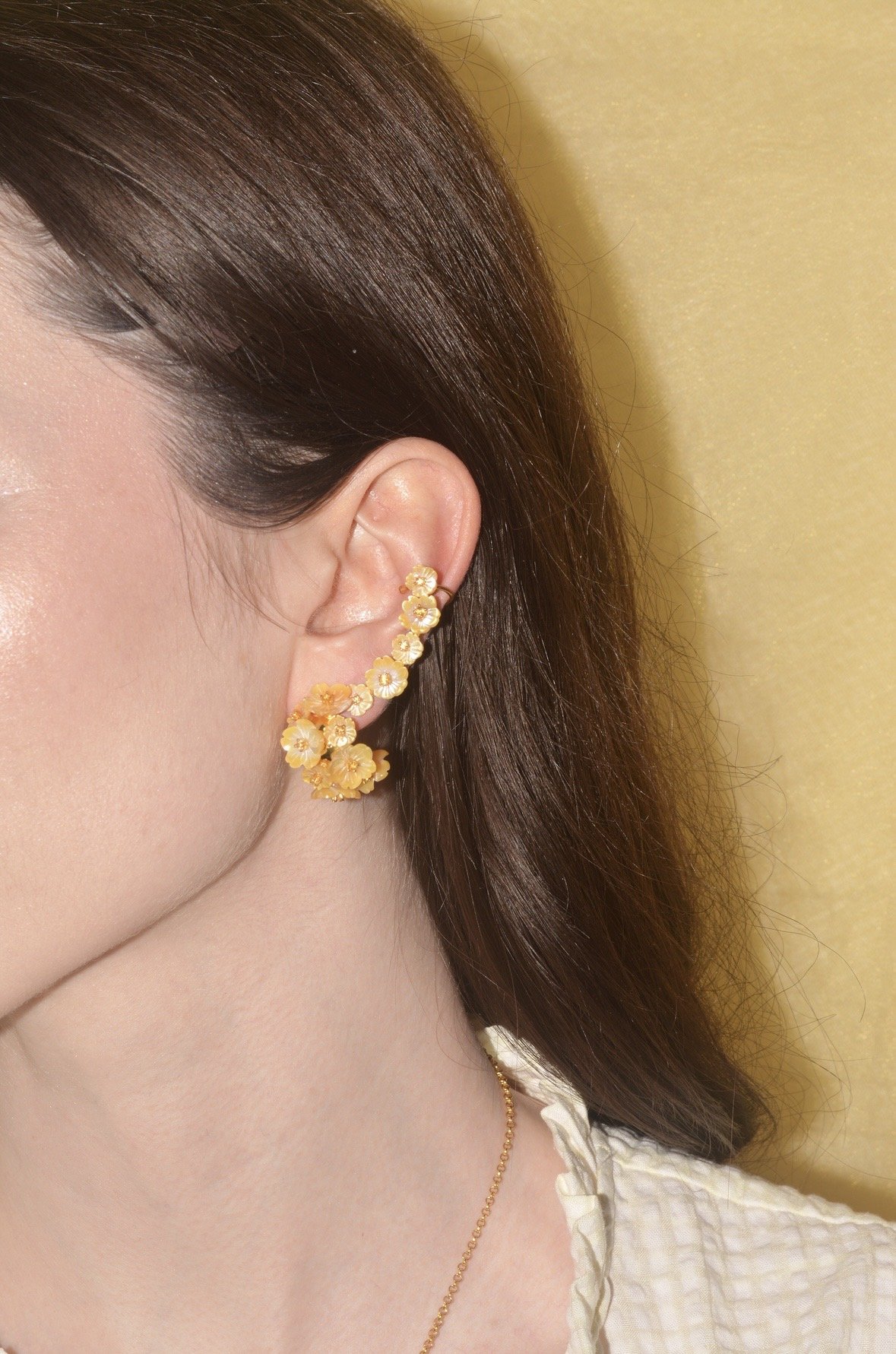
Bloom – Yellow Mother of Pearl
In yellow mother of pearl, Bloom deepens the warmth of the palette. The tonal harmony between jewellery and fabric creates a seamless, sunlit finish, enhancing the softness of spring dressing.
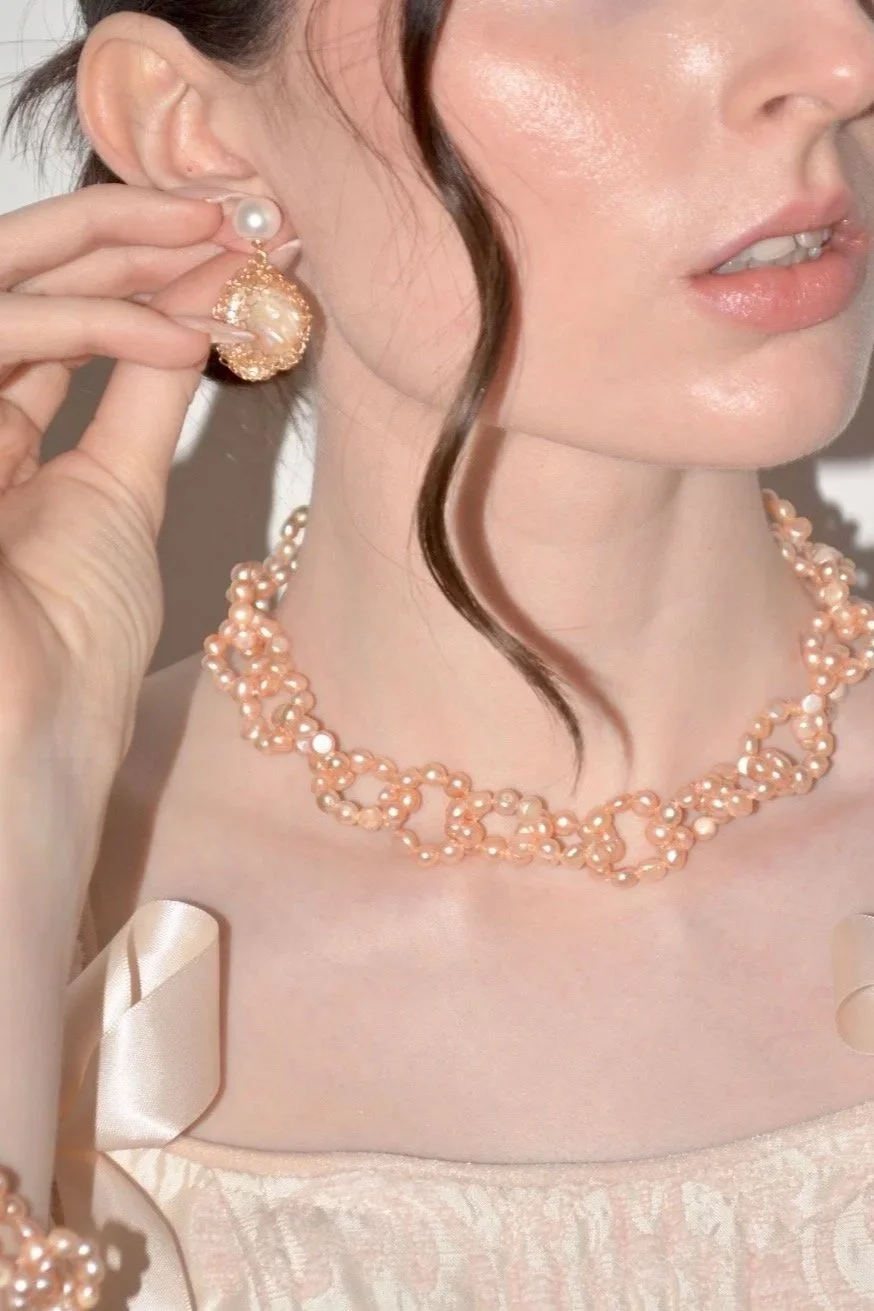
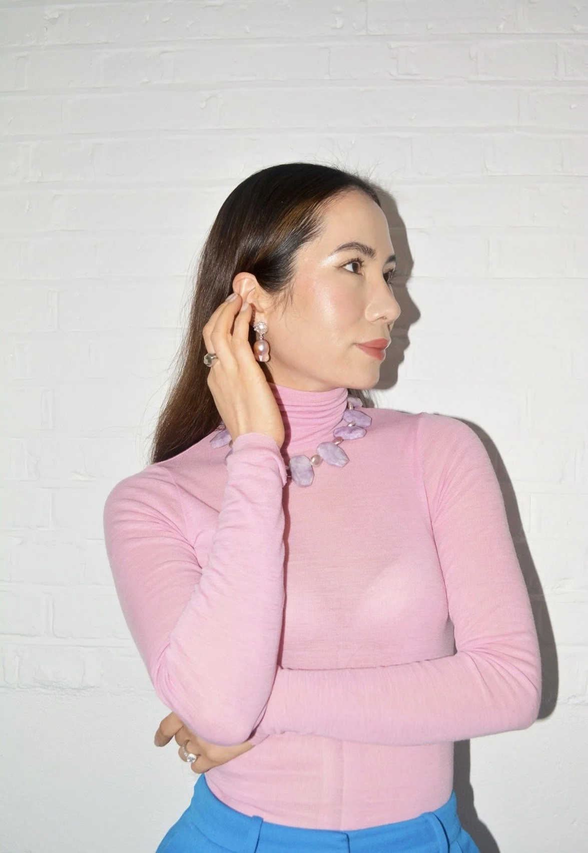
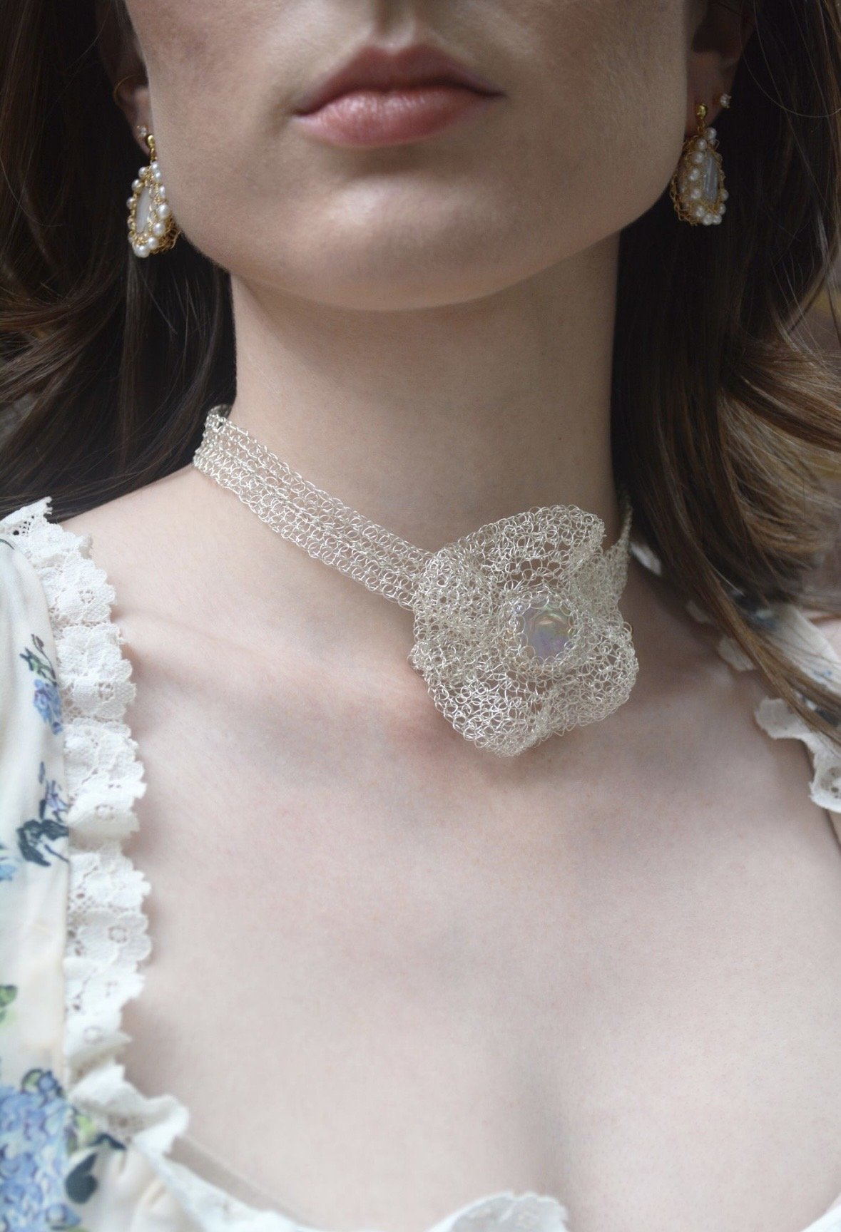
Pastel Pink
Pastel pink feels timeless. Soft, feminine and quietly expressive, it pairs beautifully with pieces that carry texture, translucency and organic form.
Flora
Inspired by hand-crocheted forms, Flora translates softness into sculptural jewellery. Its delicate structure mirrors the lightness of pink, creating a quietly romantic finish
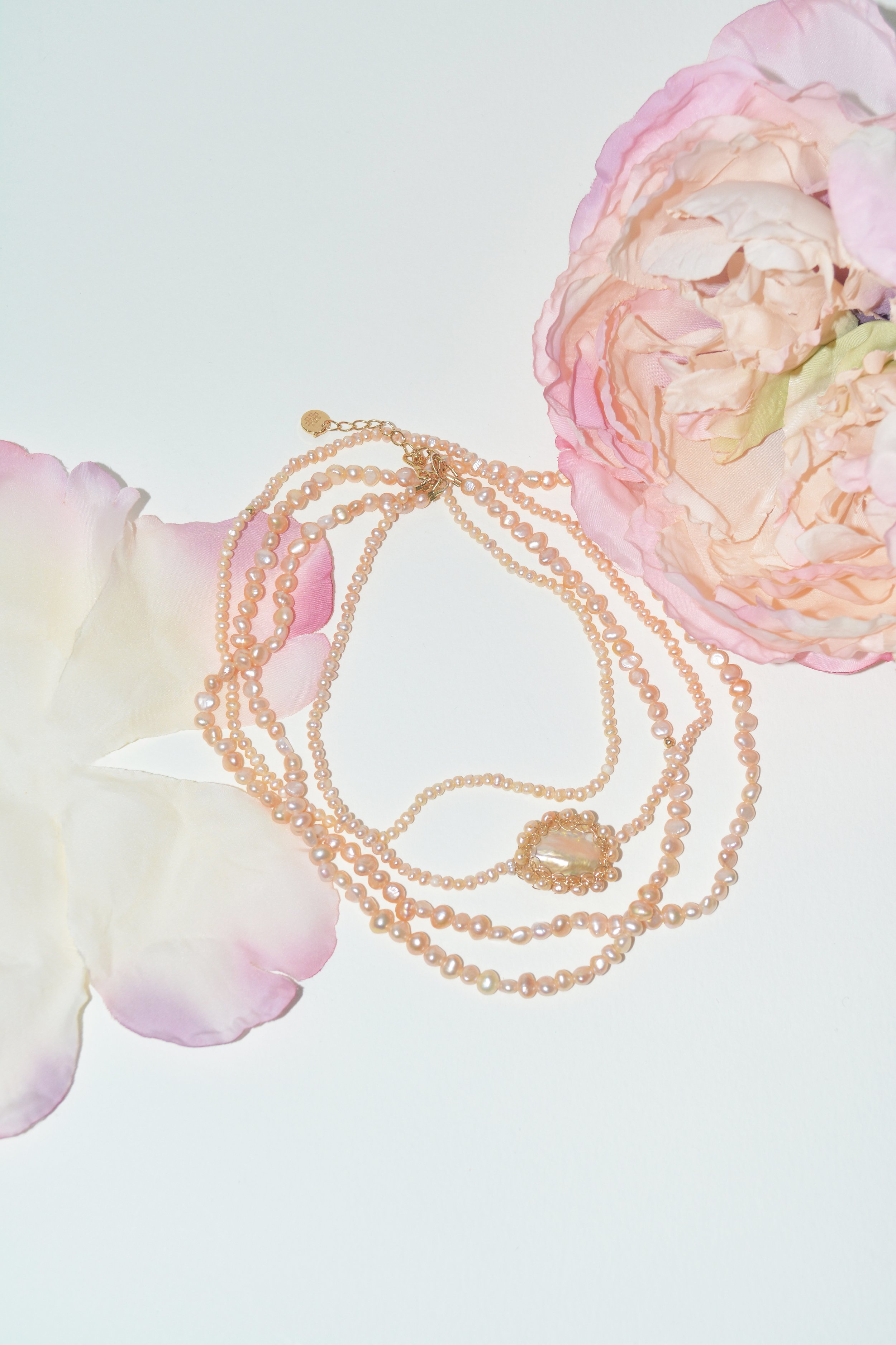
Pink Pearl Buoyant20
Pink pearl Buoyant20 combines freshwater pearls with intricate woven forms. The soft blush tones and fluid structure create movement and warmth, enhancing the femininity of pastel pink.
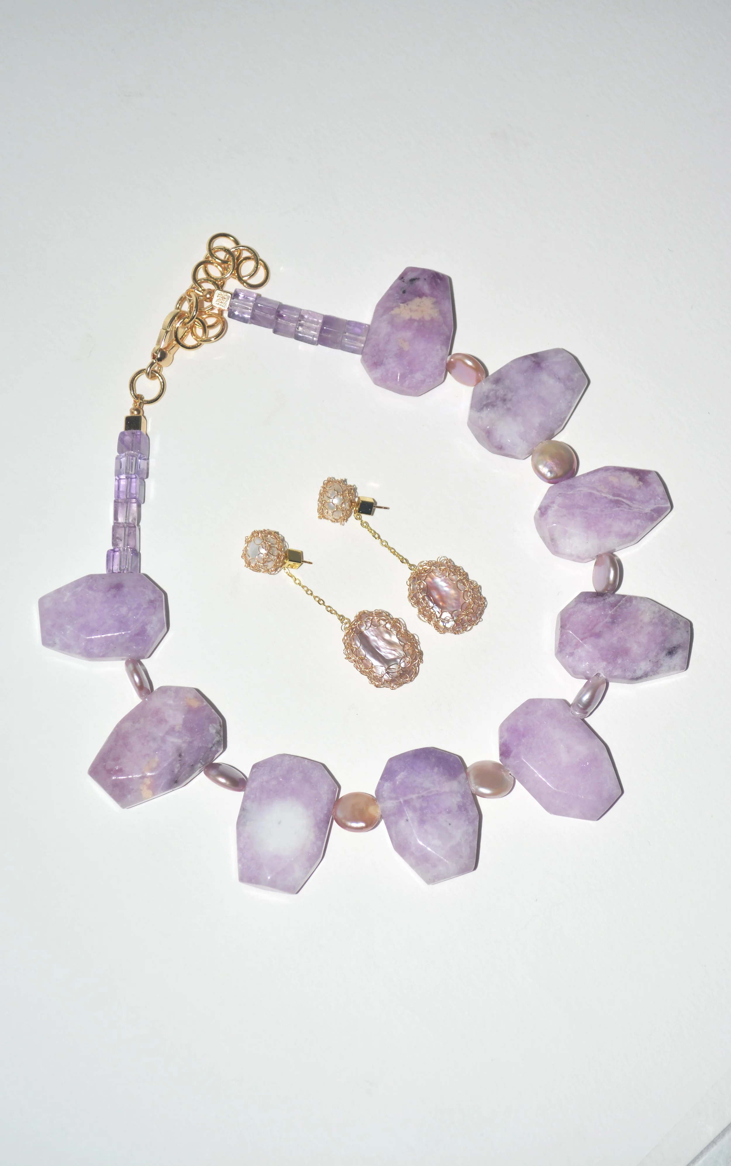
Mica
Mica introduces a soft, natural shimmer. Its translucent surface reflects light subtly, adding dimension without overpowering the gentle tone of pastel pink.
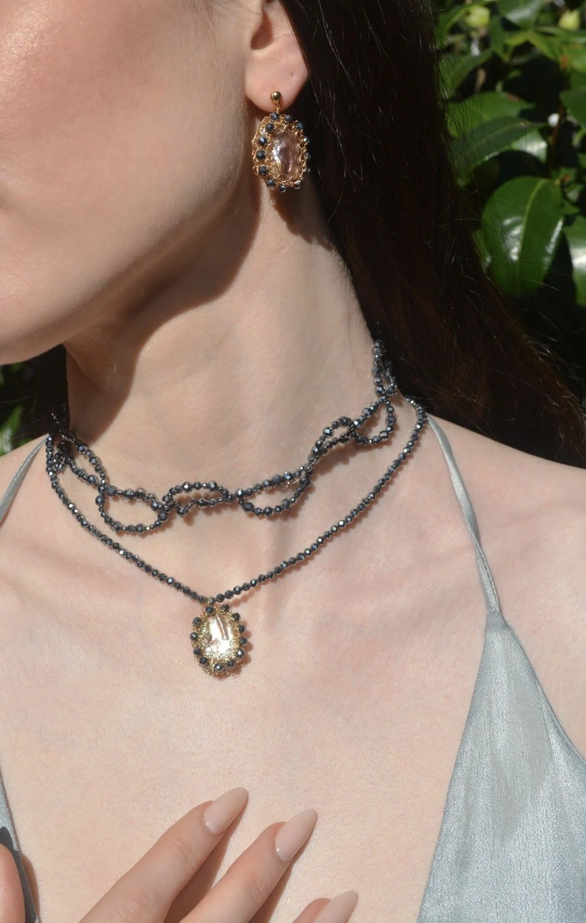
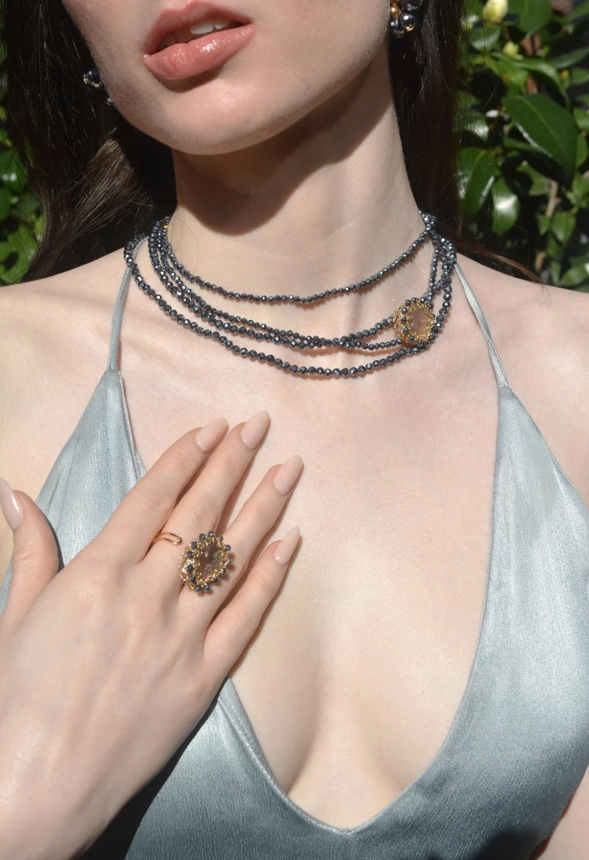
Icy Blue
Cool blue tones bring clarity and calm. Clean and refreshing, they pair beautifully with pieces that reflect light through translucency and movement.
Buoyant20
Blue toned Polka in Buoyant20 introduces soft washes of colour through handwoven structures. The natural tones of turquoise, aquamarine and topaz catch the light gently, echoing the fluidity of the sea.
Stardust Polka
Stardust Polka adds a fine, scattered sparkle. Its delicate placement of stones reflects light across the surface, bringing subtle brightness to cool blue tones.
Silver Flora
Silver Flora offers a cooler interpretation of floral form. The sculptural design, paired with luminous silver, enhances the crispness of icy blue palettes.
Fresh Green
Green feels vibrant yet grounding. Whether soft or saturated, it brings a sense of renewal that pairs beautifully with natural materials and fluid forms.
Peridot Polka
Peridot Polka introduces fresh, lively colour through scattered gemstone detailing. The brightness of peridot catches the light with movement, adding energy while remaining refined.
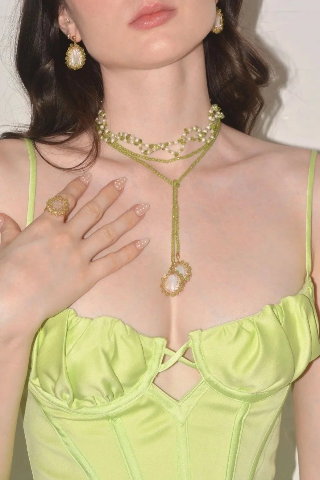
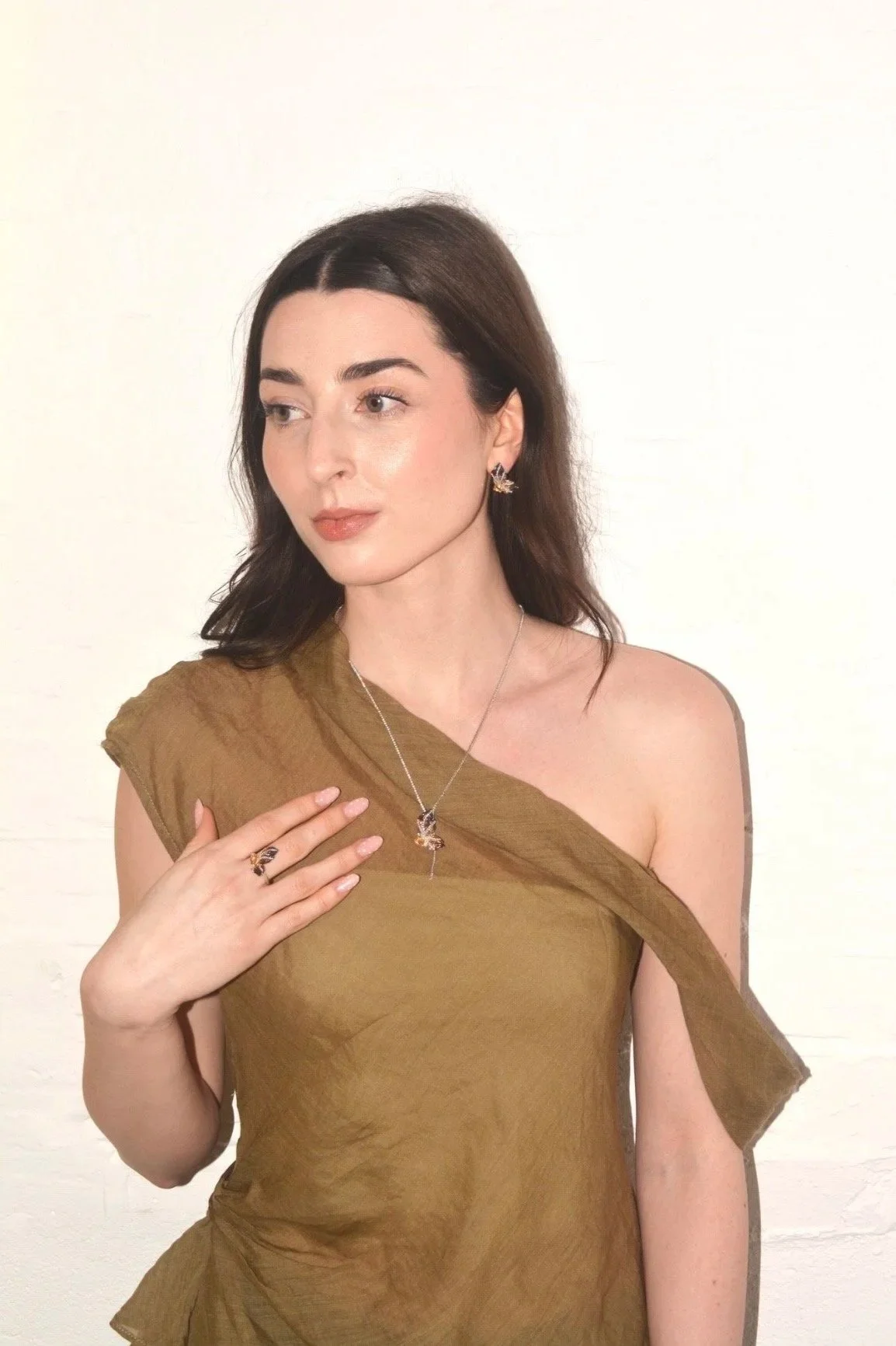
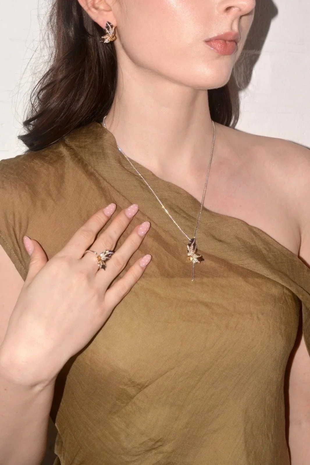
Anabella
Anabella introduces soft structure through beaded forms and fluid silhouettes. The gentle arrangement of stones and pearls creates movement, allowing the piece to catch the light from every angle.
Worn against deep green tones, Anabella enhances the vibrancy of the colour while maintaining a sense of softness. The balance between structure and fluidity allows it to feel both statement and effortless.
Thoughtfully pairing jewellery with colour allows each piece to enhance the tones you wear, bringing balance and elegance to every look. Through subtle contrasts, soft reflections and natural forms, styling becomes intuitive, expressive and quietly elevated.